Simplifying SCORE
What tool or graphic would you use to guide a quick exploration of strategy or tactics?
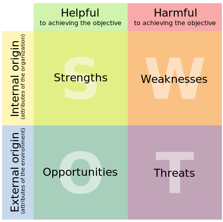
Many people would use SWOT, of course – the classic 2×2 grid of Strengths, Weaknesses, Opportunities, Threats:
The catch is that it’s very limited – so limited that someone on Twitter the other day derided it as “the plastic knife of heart-surgery”.
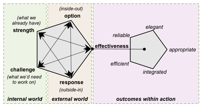
So for some while now I’ve been presenting a broader-scope alternative called SCORE:
The key differences from SWOT are that:
- it drops the pejorative language (‘Challenge’ and ‘Response’, not ‘Weakness’ and ‘Threat’)
- it treats opportunity and risk as flipsides of each other, that must be treated always as a mirrored pair (in ‘Options’)
- it emphasises the impact of everything on overall effectiveness
- it’s an iterative process – we continue bouncing back and forth between the domains until we feel we’ve gathered Just Enough Detail for decision-making about the respective concern
It does work very well, yet in practice I’ve found that some people find even this difference from SWOT somewhat challenging. Seems like there’s a need to simplify it even further, whilst still retaining all of those changes and extensions above.
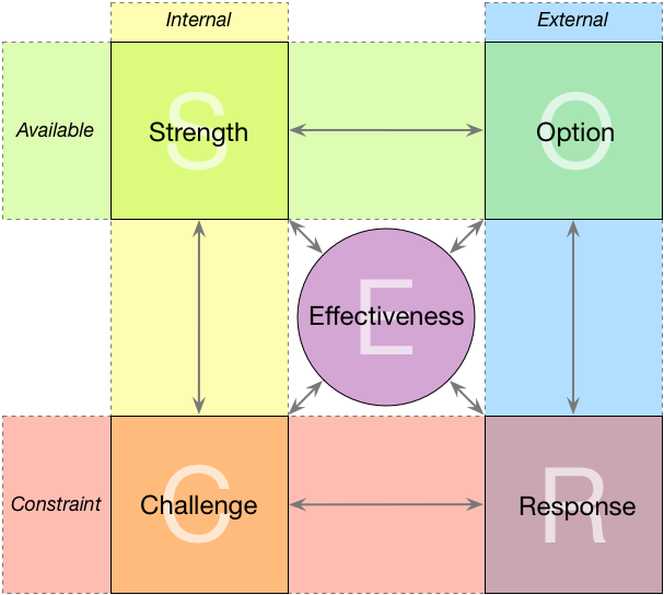
One option would be to change the layout back to something closer to the 2×2 matrix of SWOT, with the ‘Effectiveness’ domain moved into the middle:
The process to use with this would remain exactly the same as before, as described in the post ‘Checking the SCORE‘: the only difference is in the layout.
The main advantages of this more SWOT-like layout are not just in familiarity, but also because it’s easier to put up on a whiteboard or suchlike, and probably easier for laying out sticky-notes, too.
The real risk of using this more SWOT-like layout is that people might think it’s just the same as SWOT – which it isn’t, because there’s that key emphasis on effectiveness, and a much more in-depth process.
I’ll admit that personally I still prefer the twin-pentagons layout of the original SCORE, but I can understand that many would prefer the more SWOT-like layout – for practical reasons, if nothing else.
Over to you, though – which layout would you prefer? What differences – if any – would each layout make to way you extend SWOT or suchlike into a more strategy-oriented SCORE?


In terms of my own understanding of SCORE, either format works fine. One reason I think the new, SWOT-like format might work better is the one you mention – if you stick it up on a wall, it’s easy to collect ideas/thoughts on each piece via sticky notes.
Many thanks, Ric – that really helps. Will keep going on developing this further, anyway.