Form follows non-function
“Form follows function” – that’s what we were always taught at design-school. Yet is that actually true? I wonder…
There was nothing in particular that triggered this one off: it was just one of those ‘first thing in the morning’ things, together with revisiting a previous post of mine, ‘Architecture is non-functional‘, and thinking about a couple of slides that need to go into my upcoming EA training-course about the old requirements-model distinctions between ‘functional’ versus ‘non-functional’.
[At this point I’d also best slip in my pre-emptive apologies to Gene Hughson, who writes an excellent blog entitled ‘Form Follows Function‘ – no slight or slur intended, honest! 🙂 ]
The classic assertion is this: that the function that a device or system or whatever is intended to perform, should guide the design, and the design in turn should reflect the function – hence the assertion that form follows function. A bicycle should look like a bicycle, something that rolls on two wheels along a road; a cigarette-lighter (okay, old-fashioned example, I know) should look like something that would light a cigarette; a phone should look like a phone; and so on. Hence, again, the user-interface for an IT-based application on screen or handheld should be kind of self-explanatory, easing the user-experience.
All well and good: yet what is it that determines the function?
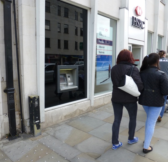
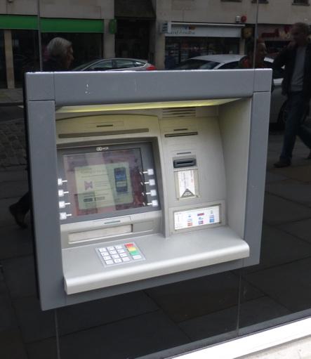
Let’s take an everyday example – the humble, ubiquitous ‘hole-in-the-wall’ ATM:
If form follows function, then what actually is the function here? The quick summary is that it’s not just one function, but a suite of easily-automatable bank-teller transactions – hence ATM, Automatic Teller Machine. There are obvious bank-oriented functions:
- enquire bank-account balance
- provide cash in standardised bill/note amounts (combinations of £10 and £20 notes, in this specific case)
- enquire credit-card balance
- pay credit-card balance by funds-transfer
And it supports a few other transactions on behalf of partners:
- donate to charity or charitable-appeal, as selected from a predefined list
- add phone-credit to a partner phone-service provider, by funds-transfer
There are also some maintenance functions which, of course, ordinary customers don’t and shouldn’t see.
That’s about it, really: all fairly straightforward.
To support those functions, we’re going to need the following:
- some form of display to the customer – in this case, the screen, and also a small thermal-printer for receipts (and maybe also a larger printer for bank-statements, in this case, with an output-slot visible as a long dark line above the screen)
- some secure means to identify the customer – in this case, a reader for a pin-and-chip card, and a keypad to enter a matching PIN
- some means to obtain command-input from the customer – in this case, that same keypad, plus the buttons either side of the screen
- some secure means to dispense bills/notes to customers
Again, there’s also some other less-obvious or intentionally-hidden support-functionality:
- built-in lighting, to make the unit usable at night in street-accessible conditions
- loudspeaker, for audio-feedback for blind customers or real-time customer-service help, and also for security-alarm
- status-lights to indicate which input and/or output slots are active (visible in this case as as a short dark line above each of the respective slots)
- security-camera to capture customer’s face when using the system
- logging-printer for bank audit-purposes
- reloadable safe, to secure bills/notes, separate from yet associated with the cash-dispenser
- processor(s)
- network connections
- power-supply
So, what form should all of this take?
If form follows function, then every ATM should look exactly the same, pretty much without any variation.
Which is sort-of true – but only ‘sort-of’, because in practice just about every bank seems to have a different layout:
- some have touchscreens (this one doesn’t)
- some put the keypad beside the screen (rather than in front, as in this case), or under the card-reader
- there’s quite often (as here) more than one keypad, though sometimes none at all
- the customer-identification card-reader or equivalent can again be just about anywhere, with quite a few variations of form and slot-configuration, and occasionally use other forms of machine-readable ID such as Bluetooth-tag or RFID-tag or even an iris-reader
- the customer-output printer(s), if present, can be just about anywhere
- the cash-dispenser can be just about anywhere
The function itself doesn’t tell us all that much about where these things have to go, and their physical relationships with each other.
Instead, it’s so-called non-functionals – often practical human concerns, and/or security concerns – that determine most about those physical relationships. Which, in turn, are well-illustrated in this case:
- this system uses a card-reader, which is placed to the right of the screen because most people are right-handed and will ‘naturally’ hold the card in the right hand
- the main user-interface – screen, keypads etc – is inset relative to the overall frame, because the customer’s body itself provides some measure of physical- and visual-security, such as against others seeing what is on the screen or entered on the keypad
- the cash-dispenser slot is inset on the left-hand side, to minimise the risk of snatch-attack whilst the notes/bills are exposed
- the cash-dispenser slot is horizontal and below the screen, because that configuration provides the best trade-offs for mounting, loading and securing a reloadable-safe, compatibility with typical paper-feed mechanisms, and not clashing with placement of other components
- the display is of a particular size, because it needs to be read at a known distance by people with varying acuities of vision
- the keys on the keypad(s) are of a particular size, because they need to be used by people with varying sizes of fingers, with minimum risk of data-entry errors
- the unit as a whole has a particular appearance and ‘feel’, because it has to line up with corporate branding and, often, unstated non-functionals such as implied by Conway’s Law
The most common variations on form and layout are with components where the non-functionals are not so critical, such as for the receipt-printer – it’s perhaps most often in the position shown in this example, above the card-reader, but I’ve seen it placed just about anywhere, relative to other components. And the internal components that drive all of this functionality, of course, can go just about anywhere that fits – subject to other non-functionals, such as temperature-management, inter-component interference, and accessibility for maintenance.
When we look at the unit as a whole, the same point applies. From a pure functional perspective, the physical position and mounting of the unit makes no difference at all: we could put it just about anywhere, as long as it can do its job, its function. It’s the non-functionals that ultimately determine exactly where it goes – such as:
- market relevance – it needs to be somewhere that people will use it, sufficient to justify the cost of installing and operating it
- physical security – it needs to be located and mounted such that criminals cannot steal the entire unit
- accessibility – it needs to be at an appropriate height, and with appropriate access, visibility and security, such that people can actually use it
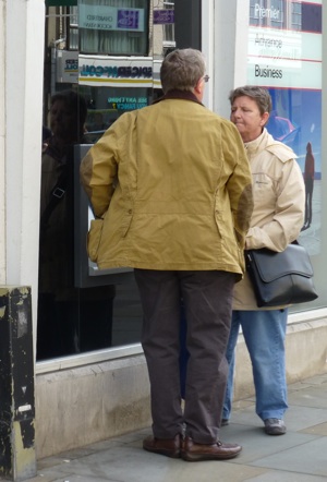
That last point is particularly relevant in this case, as the unit is mounted unusually low on the wall, for use at wheelchair-accessible height:

Pedestrians can still use it, though it’s somewhat awkward:
Put together, the non-functionals in effect determine the minimum viable shape, size and weight of the unit, and probably much if not most of its physical appearance and means and modes of operation. Sure, there’s function there – otherwise there’d be no point (other than as a piece of street-art, perhaps?). But in terms of overall form, the form doesn’t follow the function: form follows non-function.
The real problem, of course, is that ‘non-functional’ is a highly-misleading term: so-called ‘non-functional’ requirements such as usability, security, reliability, durability and accessibility all combine to determine a great deal of what we see on the surface as ‘function’.
Which, in turn, does give one somewhat flimsy excuse for the ‘form follows function’ motif, because much of the form does in practice depend on the subsidiary functionality required to satisfy the ‘non-functionals’. But it is a flimsy excuse – not enough to justify the usual claims made for ‘form follows function’.
And there’s another simple counter-argument, anyway: in reality, ‘form follows function’ is itself an example of form following a ‘non-functional’, in this case an arbitrary requirement that form ‘should’ follow function. Whatever that is… 🙂
The closest we really get to ‘form follows function’ is that yes, it does help if the surface form and user-interface (in the broadest sense of that term) provide or underpin a user-experience in which the item’s function and usage is seemingly ‘self-evident’. There’s a lot of work that goes into creating that sense of ‘self-evident-ness’, as any user-interface designer, user-experience designer or service-designer would attest. And that applies to just about everything: from bridges to buildings, from cars to kitchen-utensils, from software-architecture to enterprise-architecture, or whatever, the so-called ‘non-functionals’ are more critical than the ‘functionals’, for the form and effective function – the user-experience – of that design.
Again, no particular point that I’m making here: just seemed worth saying, that all.
Over to you for comment, anyway, if you wish?


“At this point I’d also best slip in my pre-emptive apologies to Gene Hughson”
None needed, I assure you and many thanks for characterizing my blog as “excellent”.
I see the concept of ‘form follows function’ as necessary, but not sufficient condition for a design – for example, wings will be needed for flight, but penguins and ostriches show us that not everything with wings will fly. I definitely agree that meeting the non-functional/quality of service requirements are the key to a successful design. This is my objection to the idea that a design can “emerge” from doing the “simplest thing that could possibly work” – how well the design functions is much more important than the minimum requirement that it functions (“well” being in the eye of the user).
As an aside, I’ve challenged my title before as well, noting that form initially follows function, but then function begins to follow form as architectural inertia sets in.
Thanks, Gene – and yes, that’s a really crucial point about “how well the design functions… (‘well’ being in the eye of the user)”.
Tom writes:
“the function that a device or system or whatever is intended to perform, should guide the design, and the design in turn should reflect the function – hence the assertion that form follows function.”
I have always considered “form” to mean much more than just the outward appearance of an artifact.
“A bicycle should look like a bicycle, something that rolls on two wheels along a road”
A Segway satisfies that description, and it looks nothing like a traditional bicycle.
“a cigarette-lighter (okay, old-fashioned example, I know) should look like something that would light a cigarette”
A match is just as functional as a cigarette lighter as is a butane or naphtha fueled lighter, and looks rather different from either of them.
“a phone should look like a phone”
A modern smartphone or “dumb” clamshell phone looks nothing like an “old fashioned” desktop phone with its coil cord connected handset, which in turn looks nothing like the even more old fashioned “vertical post” phone with its separate speaking and listening horns.
Tome concludes by observing:
“the so-called ‘non-functionals’ are more critical than the ‘functionals’, for the form and effective function – the user-experience – of that design.”
I note that said user experience is utterly without value if the artifact does not function as it is supposed to.
len.
Thanks for the comments, Len
I perhaps ought to reiterate that “A bicycle should look like a bicycle” etc was the kind of stuff we had spouted at us at design-school, and which I felt was a bit too much like circular-reasoning even then – so yes, all of your points taken, though I dunno that I’m actually the right target there?
@Len: “I note that said user experience is utterly without value if the artifact does not function as it is supposed to.”
Yes, agreed, entirely – and that was the one point about the old ‘form follows function’ motif that I did agree with, and that wasn’t inherently circular-reasoning.
The point I’d made some while back, in the post ‘Architecture is non-functional’, is that whilst, yes, obviously an architecture has to deliver the requisite function, the variances and criticalities that dominate the final design usually depend much more on so-called ‘non-functionals’ than on function as such.
To continue the ATM example, the transaction-side functions of an ATM and a high-speed, high-volume stock-market trading-system are very similar, but the non-functionals (speed and volume) in each case place very different demands on the architecture and its implementation.
The same applies to the outward form in each case: for example the requirement for a screen-and-keypad user-interface doesn’t arise from the transactions as such, but from the fact that those transactions are to be done by a human rather than solely by another machine – a distinction that would typically be described as a ‘non-functional requirement’ in a high-level system-diagram.
I hope that clarifies the points I’m making in the main article above?
Tom replies to me:
“I dunno that I’m actually the right target there?”
Forgive my faulty inference that by citing such words, you were endorsing them.
“the variances and criticalities that dominate the final design usually depend much more on so-called ‘non-functionals’ than on function as such.”
And I got the impression that you were again arguing as such. I will readily agree that the “non-functionals” are as important as the “functionals”, but I’m not sure they always “dominate”.
Warning — I have been provoked. You have set a Quixotian windmill before me.
One of the reasons I am so fond of the idea of “essential” in architecture is that the word offers at least the possibility of a binary discriminator (i.e., something either is or is not essential to the artifact’s fitness for purpose) and it renders irrelevant the idea of relative importance of design elements (something that is essential cannot be “more essential” than something else that is also essential.
While one can certainly imagine that some design element might have more severely adverse consequences were it to be overlooked than some other design element, this is a bit like “the hole’s not in my end of the boat”; it really doesn’t matter, because omission of any essential element by definition renders the artifact not fit for purpose. If the particular way its omission manifests itself is acceptable, then you have effectively redefined what fit for purpose means for the artifact, and your original idea thereof was actually over-specified (i.e., included things that were not actually essential to fitness for purpose).
len.
Oops, I concede that you did not say “always”, you said “usually”. It still implies that some things can be “more essential” than others.
len.
Form follows function is a useful insight from the architecture of high modernism. It would be a shame if the subtleties of the relationship between form and function was lost in the ossification of a cliche.
When Sullivan coined this phrase – in the late nineteenth century – information systems were not quite so culturally influential (they existed however). The focus was on the built world and function was more the effect than the object of design.
I am more inclined to think of the relationship between form and function in terms of affordance. The steering column versus floor shift design choice for car transmission control is an interesting point. The discussion about which form best fits the function will tend to follow the driving experiences of the interlocutors. Thank goodness conventional affordance takes precedence with the foot pedals and the brake, clutch and accelerator are always in the same configuration.
I am not saying anything that Donald Norman hasn’t already said far more eloquently in the Design of Everyday Things.
I think the ‘looking like’ relationship you are critiquing is one way of providing affordance. But affordance trumps isomorphism. As noted the iPhone increased affordance – to the point pre-linguistic children could operate some functions – while generalising form to the point it was nearly unrelated to function.
For me affordance is the killer feature of any design. It says the designer created a form that speaks the user’s language.
I like your ATM example – and now I am wondering what an ATM would look like if the designer found a way to offer equivalent affordance to operators in and out of wheelchairs?
And boy do I share your distaste for the term non-functional.