A tale of three toolsets
Time to get back on the toolsets trail…
First, though, I’ll let Phil Beauvoir have his own rant about the current state of supposed ‘EA-toolsets’ – as per a series of Tweets he pushed out a few days ago:
- Better to have fewer features with an intuitive and simple design than a mass of badly-designed bloat that nobody can use. #EATools
- As a tool designer one must delight the user not confuse the user. Why do so many EA tools vendors seem to hate their users? http://t.co/uQGXUMarNH
- Perhaps because many s/w designers don’t appreciate art, music, poetry, spirit. I hate the term “software engineer”. Ugh.
- Detect a distinct lack of “heart” in this domain. … // If it isn’t about people then what the f*ck is it about?
- We are NOT software “engineers”. Isambard Kingdom Brunel was an engineer. We are hackers at best. Don’t insult IKB by calling yourself one.
- Current tools in EA domain are, let’s face it, dull and boring. Is it, as with banking and its s/w, because it’s just a dry dull domain? // Does it have to be that way? Surely this shit can be made human, interesting, delightful?
- Yep. atm it’s all just boxes and lines, boxes and lines, boxes and lines, boxes and lines, boxes and lines…
- The only person I’ve seen so far propose anything more than “boxes and lines” is @tetradian in his blog series on toolsets. // And @jbsarrodie and @RnA_EA also have some great ideas.
- I’m up for killing off the dinosaurs in this domain. Very large bodies, very small brains. // In which case, the operative words (to quote Robert Fripp) are “small, agile, mobile, intelligent” // Because my three-word review of all existing tools (including Archi) is “DULL DULL DULL”
As the lead-developer for the open-source toolset Archi, Phil is almost uniquely placed – and qualified – to make such an assessment of ‘the state of EA’. And note too that he’s not merely ‘knocking the competition’ – he includes his own toolset in that harsh critique of ‘DULL DULL DULL’.
Looking at so much of what’s on offer, I’d have to agree strongly with his critique – and we really do need to do better. Yet to be honest, even much of my own previous description here is still not much more than a slightly-extended version of ‘boxes-and-lines’ – ‘the ‘tell me about yourself’ criterion coming out as yet another box, and ‘tell me what you’re associated with’ as yet another bunch of lines. Perhaps it’s just the nature of what we’re working on that tends to reinforce a tendency towards dull dull dull overly-abstract boxes-and-lines…
But let’s have a brief look at three toolsets that do at least seem to be trying to do something different: Archi, Enterprise Evolver, and Ardoq. (Interestingly, each of them applies to a different part of the toolset-ecosystem, as we’ll see in a moment.) And from there, see what we could learn from these that could be applied elsewhere in the toolset space.
(As you’ll see, I’ve also added a bonus sort-of-toolset at the end, to give a useful contrast to those three toolsets.)
Archi
[Disclosure: I’ve talked extensively with Phil Beauvoir about Archi over the years, and have been a donor to the project.]
Positioning: As a cross-platform (Windows, Mac, Linux) Eclipse-based toolset, Archi (@ArchiToolkit) sits in the ‘desktop/laptop’ segment of the toolset-ecosystem.
Users and sharing: At present, Archi does not have a sharable repository: in effect, it’s a single-user toolset. (I’m told that adding a shared-repository is a key goal for the next stage of Archi’s development.) Archi can import and export various file-formats, including Open Group’s Archimate exchange-format.
Pricing: Archi is free/open-source.
Archi started out as a project funded by a consortium of universities to develop a low-cost toolset for enterprise-architecture modelling with Archimate. I believe it was intended as a free/open-source project from the start, but if not, it soon became one. It’s now one of the most popular starter-level toolsets, with several thousand downloads each month.
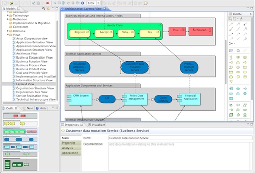
At the surface, it might seem that it’s only about Archimate – ‘fully Archimate 2.1 compliant’ and all that:
Which, as Phil says, is just ‘boxes and lines’. Dull dull dull. Though useful in its own way, of course.
Yet dig a little deeper, and you’ll discover a whole load of surprises…
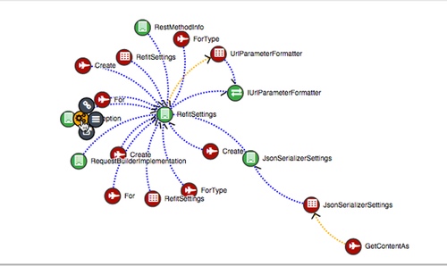
For a start, there’s a very good Archimate help-system, a ‘magic-connector’ that automatically works out what types of entities can be ‘legally’ connected together and in what ways, and a ‘visualiser’ that displays relationships between elements not solely as a standard Archimate view, but as an often more-intelligible radial-tree graphic.
Then there’s the Sketch View, which allows freeform sketching, yet which can also transform those elements into Archimate views.
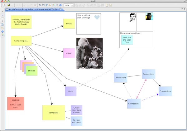
And not only is there support for Business Model Canvas – increasingly common now amongst other EA toolsets too – but also a complete ‘Canvas Modelling Toolkit’ that “provides the tools for you to create and edit your own canvasses”:
For the purposes of the recent exploration of toolsets here, it’s this user-extensibility of the user-interface and data-model that interests me most. We’re not constrained by a single metamodel, or even a suite of predefined metamodels: instead, we can ‘roll our own’ and yet still be compatible with other metamodels, down at the data-level.
I don’t know as yet where Phil is taking the developing of Archi next (other than that much-needed ability to share a multi-user repository), but I’ll admit I really want to see the Archi team taking this extensibility further – as soon as possible, please? 🙂
Enterprise Evolver
[Disclosure: Syed Suhail Ahmad of Capability Management Inc gave me a free copy of Enterprise Evolver to play with.]
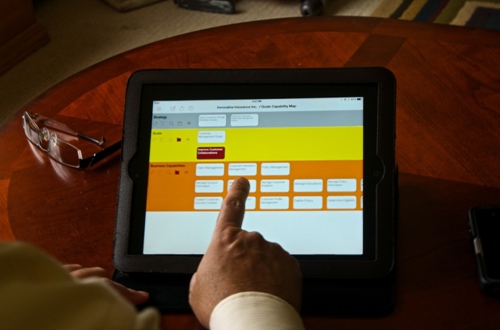
Positioning: As an iPad app, Enterprise Evolver (@EnterpriseEvolv) sits in the ‘tablet/mobile’ segment of the toolset-ecosystem.
Users and sharing: At present, Evolver seems to be set up for a single-user – or any user on the same iPad, to be pedantic – with its user-configurable repository embedded within the app itself. According to the website, it can import and export from and to Excel, as well as sending output-graphics to email or printer.
Pricing: At present, Evolver is listed on the US iTunes app-store at $44.99.
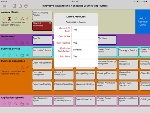
Evolver takes the ‘boxes and lines’ metaphor to its other logical extreme: there are no ‘lines’, only ‘boxes’. Associations between entities are indicated either by tables, or by vertical relationship in hierarchies, as in the purple-highlighted item in the yellow band in the image below:
Even though the absence of line-type visual connections might seem an extreme constraint, it actually does work quite well – especially given the trade-offs necessary to work on the very small screen of an iPad Mini. It’s also clear that a lot of thought has gone into getting the most out of the limited screen real-estate, and the different approaches needed for a touch-based rather than mouse-based user-interface.
Overall, the amount of functionality that they’ve managed to squeeze into something that can literally fit into a handbag or a large pocket really is impressive. I’ll admit that, despite the good built-in help-system, I couldn’t find all of the functionality directly on the app itself, but a wander through their website and weblog indicates that there’s a lot to be found:
The catch for me is that its core metaphor is perhaps best described as a kind of visual-ontology, with everything built around entities and consistent property-sets for those entities – in other words, again, the ‘boxes’. A lot of EA-folks do work that way – and for them, the approach used in Evolver would work very well indeed. In my own work, though, I’m usually far more concerned about the connections, the relationships, the ‘lines’: the properties of entities are important, yes, but for the most part somewhat further down the track than where I’d usually work. The lack of balance between ‘boxes’ and ‘lines’ here is something of a deal-killer: the ‘boxes’-only approach doesn’t line up well enough with the way that I work.
In that specific sense, Evolver isn’t really for me. But it could well be very useful for a fair few other EA-folks – especially at that low a price. I’d certainly recommend it as well worth taking a look, anyway.
For our purposes here, perhaps the main points of interest are:
- designed specifically for tablet/mobile
- uses a touch/gesture user-interface metaphor, rather than mouse/keyboard
In other words, it’s one of the first real instances of someone filling that key gap in the EA toolset-ecosystem. It’s also only the first version of the app, too, so it’ll be interesting to see how it develops onward from here.
Ardoq
[Disclosure: Ardoq has been a client of mine, following up on conversations about the recent ‘toolsets’-series of posts on this blog. I’ll also admit a certain bias towards the Ardoq team, as to date they’ve been the only commercial tool-vendor who’ve explicitly sought out to understand what I’ve been trying to explain in this series of blogs.]
Positioning: As a web-delivered SaaS application, Ardoq (@ArdoqCom) sits in the ‘desktop/laptop’ and ‘tablet/mobile’ segments of the toolset-ecosystem.
Users and sharing: As a SaaS application, Ardoq can support any number of users, and is built around a shared-repository with near-real-time updates pushed to other users. It has extensive user-definable import and export, and can be set up for automated near-real-time update, such as from a CMDB system.
Pricing: subscription-based, currently US$29-$55/month.
Ardoq is not really an ‘enterprise-architecture’ toolset as such: in fact, as indicated both by the name and the descriptions on the website, its focus is more on system-documentation. Yet because it starts from that point – an emphasis on the core EA concept of everything connects with everything else – much of its approach can be very useful for EA too:
Unlike the mainstream ‘EA’-toolsets, it isn’t built around any of the so-called ‘EA’-standards – TOGAF, Archimate, DoDAF/MoDAF and the like. Nor, for that matter, the standards at the next level towards implementation, such as BPMN or UML or ITIL: it can do all of those when it needs to, but that’s not its real purpose. Instead, as summarised on the website’s ‘Features‘ pages, the emphasis is on extensibility – the capability to tackle any ‘this goes with that’ documentation-need, and visualise those interdependencies in any appropriate way:
The key here is that Ardoq is not so much a single toolset, as a platform that links individual tools together in a single consistent frame. In that sense, if with some limitations, it’s a real-world implementation of the idealised concept that I described back in the post ‘New toolsets for enterprise-architecture‘ [‘NTEA’]:
- user-definable schemas and linking – ‘Fundamentals’ in NTEA
- schema-less repository – ‘Data-structures’ in NTEA
- user-extensible import/export via API – ‘Data-exchange’ in NTEA
- role-based access-control – ‘Access-control and linking’ in NTEA
- free-form linking – ‘Access-control and linking’ in NTEA
- web-based UI with support for keyboard/mouse and touch/gesture – ‘Devices and interface-metaphors’ in NTEA
- UI and visualisations extensible via Javascript, plus community-based sharing – ‘Editors’ in NTEA
- user-extensible querying and search – ‘Query, search and navigation’ in NTEA
- instance-level change-history – ‘Change-history’ in NTEA
It also includes a key class of functionality that I forgot to include in NTEA: near-real-time collaboration via ‘push’-type updates.
If this sounds like a sales-pitch for Ardoq as ‘The Answer’, it’s not. I do like Ardoq a lot, yet there’s also quite a lot that isn’t there as yet, relative to that idealised concept. For example, in my opinion Javascript is a truly horrible language for editor-development, certainly relative to the kind of drag-and-drop editor-builder that I’d visualised in the blog-series so far. And in any case, powerful though Ardoq’s APIs and extensibility may be, they’ll only work with Ardoq itself – they won’t work with any other toolset, whether proprietary, open-source or otherwise. In that sense, whilst Ardoq does give us some very useful pointers as to what’s implementable in real-world practice, there’s still quite a long way to go if we’re to reach the full functionality I’d described in this series.
Analog Memory Desk
[Disclosure: none needed, though I owe thanks to Ric Phillips for spotting it somewhere online.]
Positioning: As a physical item of furniture, Analog Memory Desk sits in the ‘whiteboard/manual’ segment of the toolset-ecosystem.
Users and sharing: Although nominally for single-user, Analog Memory Desk could be set up in a multi-user configuration – as many people as could fit around the desk. Storage and sharing is via a ‘repository’ that consists of a physical paper-roll, up to 1000 metres (3300ft) in length. Further sharing would be via photograph or video – there is no direct means for electronic capture.
Pricing: ‘free’/open-source (the plans are published on designer Kirsten Camara’s website under a Creative Commons BY-NC-SA licence).
It’ll be interesting to see just how many people look at the computer first in the photo below, rather than realising that the ‘EA toolset’ we’re talking about here is actually the table that the computer is resting on:
In a physical sense, there are two essential parts to this toolset:
- the roll-feed mechanism, giving a nearly infinite length to the total workspace
- the three-part work-surface – wood-panel backplane, paper-roll as the recording-medium, and glass top-surfaces to act as paper-guides and to provide rest-space for pens, computer etc
In this version it’s configured as a single-user desk, with some of the work-space covered such that it can be used as a regular desk. But now imagine a taller stand-up table, perhaps using an even wider paper-roll, such as from a continuous-feed printing-press; or imagine it kind of flattened-out, with the paper-roll at the same level as the table-surface, and wall-mounted like a whiteboard; or any other configuration that might make sense in practice. Starting to look even more useful, yes?
Now imagine further making a habit of writing the current date on ‘page’ each day; perhaps also drawing a strong vertical line across the page as a separator between the days. Given the roll-feed, that means that it would be easy to scroll backwards and forwards through quite long periods of work-time, picking up all of the passing notes and comments about projects and ideas and people’s contact-details or whatever. How useful would that be for your EA work-team?
Now imagine yet further that each day you take a series of photographs of whatever has been scrawled down on the ‘Analog Memory’ during that day, and then post them up onto Evernote or suchlike. (If it’s in Evernote, you might also be able to use automated OCR conversion-to-text for at least some of the content.) That would give you an ongoing anywhere-accessible record of the shared ‘Analog Memory’ of everyone in the team, or visitors to the team, or whoever. How useful would that be for your work-team?
And now imagine translating the whole thing into electronic form – as an iPad app, for example. The same idea of an infinite-workspace, sideways-scrolling, but tagged by day or whatever, and also sharable across a whole work-team, project-team, or whoever we need to share it with. We could perhaps hide or show specific sections according to access-rights, in the usual way as for any other type of database. How useful would that be you your work-team? – or just to you yourself?
Interesting, yes?
What can we learn from this?
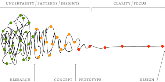
Let’s take each of those descriptions above, and place them in context of the Squiggle:
Each of the tools above not only addresses different parts of the toolset-ecosystem, but also different regions of the Squiggle:
- Archi’s Archimate implementation sits way over on the right-hand side of Squiggle, but the toolset’s heart is more towards the mid-range – the yellow-dot region – via its support for user-definable canvases and the like
- Enterprise Evolver sits perhaps more solidly in the right-hand side, but with its ‘what-if’ support it probable covers the whole of the red-dots range
- Ardoq sits perhaps somewhat more into the yellow-dot/red-dot boundary-region, with its in-built extensibility and strong support for dynamic change
- Analogy Memory Desk sits way over to the left-hand side of the Squiggle, a place to work with the sheer messiness of research, exploration and early-stage project-development
The catch, of course, is that none of these tools ‘play well’ with each other: probably the only common factor at all, for the first three tools only, is the possible ability to share a limited amount of structured data via, uh, Excel. Quite a long way from that very real need for ‘un-dotting the joins‘…
Yet look back at that description of the Analog Memory Desk, and all of those ideas about how to adapt it to a more team-oriented context. And now imagine being able to link all of that into any other EA-toolset, in any way that might be useful or relevant to you. That we could also pull up any of the editors described in all of the other toolsets above – Archimate, business-model, BPMN, UML, CMDB, whatever – and embed them into that infinite-workspace, connecting entities in any way we’d need, across time and space and context, to make sense of what things are, how they relate with each other, and how they change, walking through the enterprise-hologram to guide sensemaking and decision-making about the enterprise as a whole. How useful would that be? How much would that resolve Phil Beauvoir’s ‘rant’ above?
That’s what I’ve been aiming to describe in this series of posts on toolsets for enterprise-architecture.
Makes a bit more sense now, I’d hope?


“In my own work, though, I’m usually far more concerned about the connections, the relationships, the ‘lines’: the properties of entities are important, yes, but for the most part somewhat further down the track than where I’d usually work.”
Same for me, nodes and edges are all I need to model things. So now I use a workflow based on NodeXL (the class libraries not the Excel template), see http://nodexl.codeplex.com/
I use LINQPad & C#/LINQ scripts to consolidate/filter input from various sources and to create a Scapple file based on the graph visualisation created by the NodeXL library.
The Scapple file I use to sketch on and to make the visualization more understandable for others.
BTW in Scapple I have an infinite canvas which I could use as a memory desk
Thanks, Peter – and yes, it sounds like you’re a lot further ahead than I am on this, certainly in terms of implementation, and probably in terms of your thinking, too.
The next part, of course, is linking what you’ve done into what other people need to do, based on your work – and that capability to link everything together, across the whole of the context is really what I’ve on about here in this series of posts. How would you connect what you’ve done to what someone else next needs to do – a process-model, for example, or something like an Archimate mapping?
Hi Tom,
I’m sure I’m not further ahead in thinking, I just follow a different path towards a much simpler goal: create “sketched” maps as automatically as possible as a “site survey”/”left side of the squiggle” tool. Also my scope is just infrastructure which is a small part in your scope, which makes my implementation much easier.
How I connect my sketched maps to what someone else next needs to do: I take my map and show & explain it to make my point of view clear and ask how I can transform my map in something useful for the next step to take. Or how I can help to take the next step. Or I tell what I think the next steps could be and what may be the best choice (while referring to my map).
Often there are multiple sessions and (therefor) iterations of my sketched map. And sometimes I adjust and share new versions of my map during a meeting. The key to my success is speed to show that I can adapt my point of view and map based on feedback & new insights very quickly. That’s why I need the most simple tool(s) possible.
Others use my input to adapt their maps/models where needed and I give my feedback on those and adapt my maps if I discover new interesting information in other people’s pieces of information or stories.
Like you and Peter I’m also concerned about the connections.
In my day to day work, I must admit I mainly use Archi, paper and pen (which is my own, basic, “Analog Memory Desk”). And in order to keep track of my paper sketchs, I often scan then and add them into a Canvas into Archi. This way I have my own (and sharable) knowledge base containing a mix of ideas (sketchs) and ArchiMate model.
The only missing thing for me is a simple and useable concept mapping solution inside Archi (I used to use CmapTools, which is very good).
Re “I’m told that adding a shared-repository is a key goal for the next stage of Archi’s development”: that’s true, it’s a long term goal to have a good shared-repository for Archi, but you’ll soon see a simple, lightweight and (IMHO) elegant solution to achieve the same goal. Archi is going muti-user! Stay tuned 😉
BTW – I encourage every Archi user to contribute to this list of ideas: https://github.com/archimatetool/archi/wiki/Sketch-and-Canvas-revamp-ideas
Thanks, JB. Good point about scanning hand-drawn sketches into Archi’s Canvas – that’s one of the key features of Archi, because it allows us to link down in Archimate from there.
Likewise, yes, agree about CmapTools: and we probably need to talk with Phil about that, because some equivalent form of concept-mapping really shouldn’t be hard to implement in Archi – all of the basic functionality is already there, all it would need would be a slightly different set of connection-rules.
And yes, I saw your announcement earlier today about multi-user for Archi – very interesting indeed! 🙂 Very keen to see how that develops, because it’s what will really lift Archi into a whole new league.
Tom: I love your posts and this is the best in some regard. I have seen a few of these tools. I can’t make rant against them, just because I haven’t used many. But I am absolutely with you on every one of your statements.
Like all of the software architects, I have been marred by the sheer number of entities and relationships I have to keep track. A few times I created my own tool sets to help myself and coworkers. After doing that a few times, I started thinking to create a real one.
The issue I ran into is that I need to break away from my own software engineer mindset. Creating a powerful tool like Eclipse IDE will find no use in business enterprise. Your toolset posts contain a quite good list of the “requirements”. But I think we need to go further.
We need a business atlas tool by which the entire company of people can contribute and use it for their daily work. We don’t need to be a geologist to use Google map.
I started publishing my thoughts of the theoretical base of it on LinkedIn. I would be glad to share more details with you once i have more concretes and if you are interested.
Cheers.
Definitely interested, Colin! – yes, please, do keep in touch with me/us on this.
Thanks very much indeed.
Hi Colin,
You said, “We need a business atlas tool by which the entire company of people can contribute and use it for their daily work. We don’t need to be a geologist to use Google map.”
I agree with you on this. This is why the tagline for my app Enterprise Evolver is “An app for your business maps”. Anyone can use it to create any kind of map for their daily work. The meta model can be extended to accommodate any organization elements or categories and relationships. You don’t have to be an architect to use Enterprise Evolver. Anyone who knows how to create a map on PowerPoint can literally use this app to create a data driven map. A map can be tagged with unlimited number of tags and can be searched by tags. Maps can be merged, cloned, copied and reused. You can do as-is and to-be analysis and find the gaps between two states of the same map.
In next release, maps can be shared across teams through Dropbox cloud app. I am also working on adding more features to visual canvas editor (Appearance editor) so that users can visually create maps with few taps.
Thank you
Syed Suhail Ahmad
“In next release…”
That’s really important, Syed – the Dropbox sharing will change Evolver from a useful-but-limited single-user tool into something much more powerful that could be shared across a whole enterprise.
I’d be very keen to know more about the ‘Visual Canvas Editor’, because that’s what will make its extensibility much more evident.
Tom,
I am pretty sure, Enterprise Evolver can be used to map enterprise as services as described in your book “Mapping the Enterprise” .
We can capture row 0 through Organization landing page. Our meta model covers definition of each entities defined in scope (row 1). You can use Configurator to customize every entity in row 1 by adding more attributes and fields. The repository editor is used to capture data (hierarchies) for each entity. You can create a map to capture row 2 and row 3. You can create another map to link services with technologies, processes , interfaces etc for row 4. Row 5 could be another map with more detail or we can add addition detail using attributes feature in the map for row 4.
I think its doable!
Thank you
Syed Ahmad
Again, very interesting! I’ll have a play with that, following your instructions above, and report back. It may take a couple of weeks to invent the time to do it, though – if necessary, please feel free to chase me on this?
Will do! -:) but after the next release.