Simplifying SCORE, again
How can we simplify the SCORE framework – Strengths, Challenges, Options, Responses, Effectiveness – to make it more accessible as a practical, more strategy-oriented replacement for SWOT?
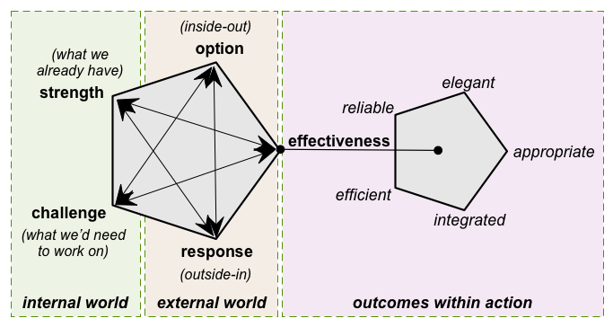
As summarised in the post ‘More on simplifying SCORE‘, the way to use SCORE is sort-of similar to SWOT: the main difference is that SCORE uses an explicit iterative process in which we bounce around between the ‘domains’ of the framework, including an emphasis on effectiveness that’s missing from SWOT. The concern here was around simplifying the ‘standard’ layout:
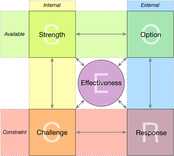
This layout works well enough as a visual-mnemonic for how the process works, but it’s not so practical on a whiteboard or notepad, as a background for sticky-notes and the like. One suggestion to make it easier to use for that kind of purpose would be to move back towards a more SWOT-like layout, as described in the post ‘Simplifying SCORE‘:
This retains the arrows from the ‘standard’ layout, to remind us that the whole thing is iterative, and that everything we place on the frame interacts with and is interdependent on everything else. The catch, of course, is that it’s still a bit wasteful of space…
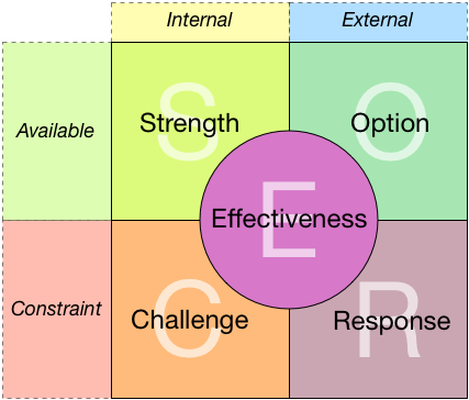
The obvious solution, then, is to go one step further back towards a SWOT-like layout, but with SCORE’s set of five domains rather than SWOT’s four:
The trade-off with this layout is that it loses the arrows – which means we’d need to pay more conscious attention to the way in which the domains interrelate with each other, and not fall back into the SWOT-style tendency to be just making lists, without exploring the overall strategic impact of each item or change.
Is it worth that trade-off – losing the arrows in exchange for a more compact layout? Or is it one simplification too far?
Which of these layouts for SCORE would you prefer?
Comments, perhaps, anyone? – and many thanks, anyway.


FWIW, I think the arrows are necessary – the interrelations are important.
Many thanks for that feedback, Gene – it really helps. FWIW, I strongly agree about the importance of the arrows to highlight interrelations: the catch is that they kinda get in the way… 😐
One other option on a pre-printed form might be to use the most SWOT-like layout for simplicity and ease of use, but also with the original pentagon-layout printed somewhere on the form at much smaller scale, off to one side, as a kind of visual-reminder of the actual process. Would that work, do you think?
that would work…of course an automated version using your meta-tool (been busy, but haven’t given up thinking about it) would avoid the paper problem of limited space
“of course an automated version using your meta-tool would avoid the paper problem of limited space” – yep, very good point, and exactly the kind of option that we’d want such a tool to offer.
“(been busy, but haven’t given up thinking about it)” – well, yeah, likewise, and likewise, though I’ll admit I’m still more than a bit spinning round in circles as to how to get properly started on this: where’s a good practical software-architect when you need one? 🙁 🙂
I think the arrows are important. I have never been a devotee to SWOT because of the perceived lack of relationship between the components. I know the relationships exist and I use the idea when formulating strategy but it is hard to present that inter-relationship to an audience who normally fixate on the acronym rather than the message.
Many thanks, Anthony – and yes, strong agree that the relationships and the ‘intertwiningness’ of the elements is crucially important.
From your response and Gene’s above, looks like the boxes-only version is indeed one simplification too far.