Insights on SCAN: Emphasising the question
Another one in this theme of insights about the SCAN sensemaking / decision-making framework that arose whilst working on clean-up for more general use of the tools in the inventory.
This time it’s a set of nice simplifications that become available if we follow a design-tactic we’ve started to use in other tools such as SCORE and Five Elements: place the current question or concern in the centre of the frame.
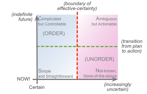
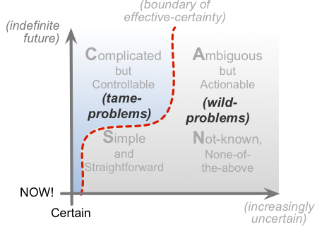
The version of SCAN we’ve been using for quite a while now shows the two axes at the base and on the left, with dotted-lines indicating key transition-points along those axes:
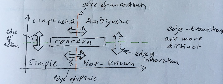
One of the key points that we can model in SCAN is the dynamics of relationship within a given task – how different aspects of sensemaking and decision-making play off against each other. For example, we can map this in terms of ‘edges’, the transitions across those key transition-points along each of the axes:
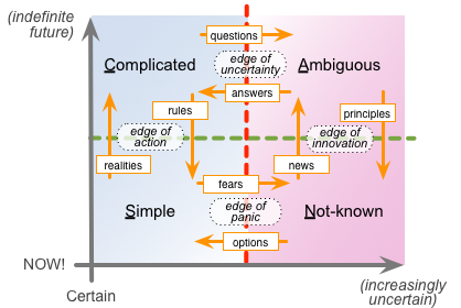
You’ll note that those edges are either vertical, between plan and action (‘edge of action’, ‘edge of innovation’), or horizontal, transiting between certainty and uncertainty (‘edge of uncertainty’, ‘edge of panic’). What they don’t show is diagonal transitions – Complicated to Not-known, or Ambiguous to Simple – because those really, really don’t work well.
If that’s not obvious, think about what each domain in SCAN represents, in terms of plan or action, certain or uncertain. Trying to force Not-known real-world uncertainty to fit a Complicated, certainty-based predefined plan – that’s not likely to work well, is it? Likewise if we allow Ambiguous to throw a mess of ‘it depends’ uncertainties at Simple, all we’re likely to get is a collapse into chaos and confusion. Not A Good Idea…
Hence, when using SCAN, we definitely do want to dissuade people from plotting out those kinds of diagonal moves: we can safely do them as a two-step, horizontal then vertical, or vertical then horizontal, but not as the direct diagonal. The catch is that this necessary directive isn’t self-evident in the basic edges-diagram above.
Yet if we place the concern at the centre of the SCAN frame, one of the side-effects is that there’s no longer any way to do those diagonal moves – because, visually-speaking, the concern gets in the way:
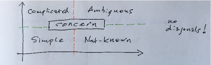
And the distinctions between each of the edges are easier to understand, because, visually, the two edges on each of the axes are now separated either vertically or horizontally by the ‘box’ that provides a visual placeholder for the concern:
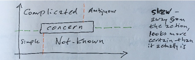
The addition of the concern-box also helps in illustrating another common in sensemaking, that I’ve elsewhere described as skew. This occurs when things seem to be more certain and predictable in theory than they actually are in real-world practice – often again leading to chaos and confusion at the front-line. Before now, I’ve shown this type of misinterpretation visually as a literal skewed line on the SCAN frame:
I’m not sure, though, that that skew-line works all that well in showing what’s going on in that type of that of context: people tend to read it in all manner of unintended ways, such as if it’s a trend-line against time, or something like that.
But if we place the concern-box in the middle of the frame, a lot of the potential for confusion disappears straight away. To represent the skew, we can now draw those transition-lines in a way that reads exactly as intended: ‘from an over-emphasis on predictable theory, things are believed to be more certain than they actually are in practice’. Or, as the graphic shows, if we over-emphasise the Complicated, and mistakenly assume that we can squeeze out and ignore the Ambiguous, then that may well make things less Simple, and more Not-known, as soon as we hit up against the real-world:
So overall, placing the concern in the centre of the frame not only helps as a reminder of what we need to focus on whilst mapping out the sensemaking and decision-making in a context, but also provides those other benefits as well. In that sense, yes, seems useful.
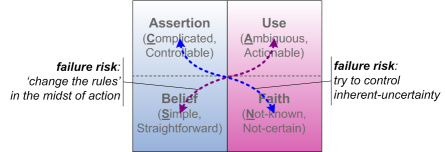
It’s true that there are a few usages of SCAN where putting the concern there would literally get in the way – such as for the ‘plot out the tasks for a surgical operation’ example in the ‘bubble metaphor’ post, in the first part of this series. In general, though, it’s a visual option that we’ll likely use more from now on.
But over to you for your opinions on this: any comments, anyone?
Leave a Reply